ELM GROVE, Wis. — The Specialty Tools & Fasteners Distributors Association has a new face.
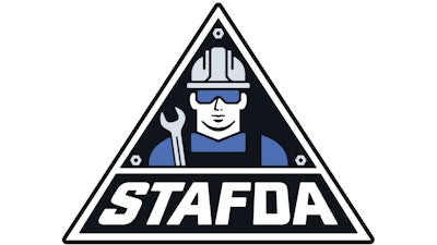
STAFDA’s blue triangle logo with “Stan the STAFDA Man” was recently updated to give it a more contemporary look. STAFDA’s traditional logo has tremendous brand recognition — with Stan and the late ‘70s "groovy" script — but for 2023 and beyond, Stan Jr. will be the face of STAFDA with a modern image and font.
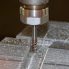
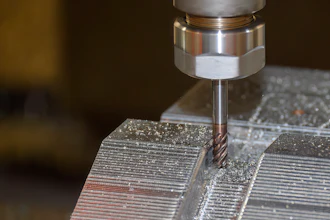
Although “Stan” has been the front man of STAFDA since June 1977, for a short time in 1976, STAFDA’s 18 founders came up with a north/south/east/west logo. Considered too bland and not conveying what STAFDA was all about — tools and fasteners — newly hired Executive Director Morrie Halvorsen called upon his former advertising contact at ITT Philips Red Head to create a logo that would convey construction and incorporate a tool generic enough to pass as a power tool, an air nailer, or even a caulking gun. But a hard hat and safety glasses were mandatory.
Meeting up at a Chicago restaurant, Halvorsen and his ad man burned through the backs of several cocktail napkins before coming up with STAFDA’s iconic logo. Stan was born on the back of a steakhouse napkin in May 1977.
Stan Jr. carries on the same look and tradition as his predecessor: hard hat, safety glasses, but this time, he’s carrying a wrench and three fasteners are riveted in each of the triangle’s corners. The new look was created by graphic designer David Saunders with Industrial Products Ltd., New Orleans.
STAFDA is transitioning to the new logo for all its branding. The association is also working on a fresh new website that will encourage more member engagement. The updated website is expected to debut in late Q1.