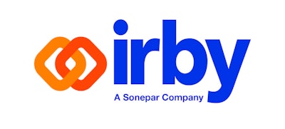
Irby, a subsidiary of Sonepar USA, announces a new logo and brand, fifteen years since its last logo release: “Irby – A Sonepar Company”.
The company’s new branding includes a vibrant yellow and orange modernized mark to symbolize connectivity, strength, and stability. The new mark complements the legacy of the existing name “Irby” which will remain intact with its traditional font and blue color, “connecting” Irby’s past to its future.
“We understand that in today’s world, connectivity to your customers is key,” says Michael D. Leech, president of Irby. “Irby is committed to becoming more connected with our customers by strengthening our relationships and becoming an indispensable solutions partner. We honor the legacy and stability of our 93-year-old company, while still connecting it to our promising and progressive future. Irby is connected to our teams (C&I, Utility, Corporate), to our customers, to our partners, and to our communities.”
Also, by adding A Sonepar Company, Irby is now recognizable as a member of the number one electrical distributor team in the world.